Good Design Is More Than What Meets the Eye
Typography shapes how we read, how we feel, and how we connect with content. It’s one of the most powerful tools in a designer’s kit, and one of the easiest to overlook — because when it’s done well, nobody notices it at all.
At Harvest Communications, typography sits at the heart of every theatre programme we design. Long before a reader takes in a synopsis, a cast list or a director’s note, the typeface has already done its job: setting a tone, building trust, and telling them what kind of story they’re about to hold in their hands. Here’s why it matters so much to us.
1. Visual Hierarchy
Typography guides your eye through content. It organises information by importance, making it easier to scan, understand and remember.
In a theatre programme, hierarchy is everything. A reader might be flicking through in the ten minutes before curtain-up, or during the interval with a drink in hand. Strong hierarchy — a bold title, a clear subheading, supporting body copy — means the biography, the cast list and the production credits all land in the right order, without the reader having to work for it.
2. Supporting Brand Identity
Typography captures a brand’s personality and creates a consistent, recognisable experience across every touchpoint.
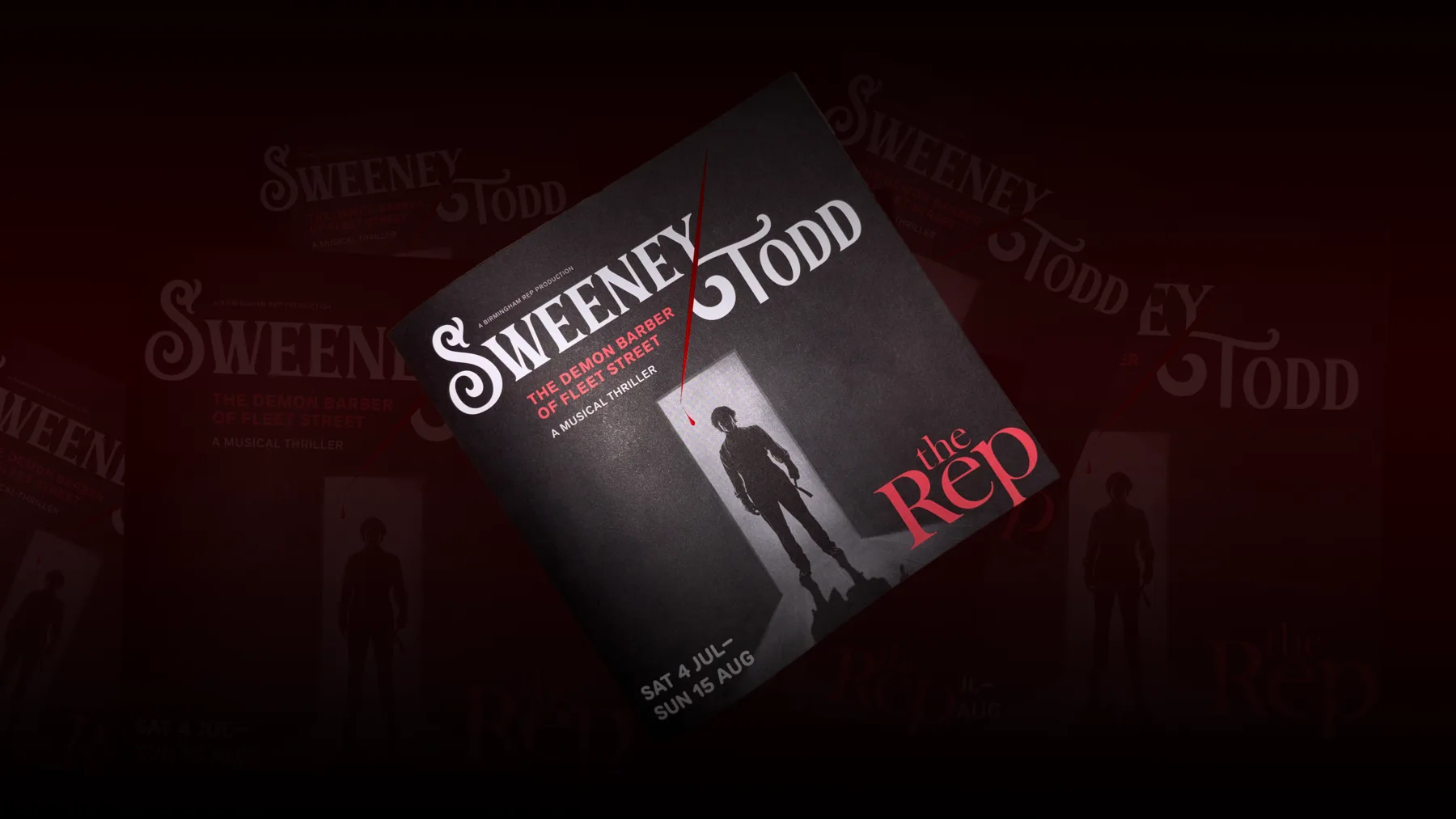
The same is true of a production. A jukebox musical, a Shakespeare revival and a new piece of political theatre each have their own voice, and the typeface is one of the fastest ways to establish it before a single image is chosen. We treat every programme as an extension of a production’s identity — the type on the page should feel like it belongs to the same world as the poster, the tickets and the set.
3. Function Versus Aesthetics
Great typography balances beauty with readability. It ensures your message looks good and works hard at the same time.
It’s tempting to reach for a beautiful, characterful display face and use it everywhere — but a programme that looks striking and reads poorly has failed at the one thing it’s there to do. Our job is to find the balance: distinctive type for titles and moments of drama, and dependable, legible type for the paragraphs an audience will actually read cover to cover.
4. The Power of Emotion and Influence
Typography sets the tone, evokes a feeling, and influences decisions. The right type can inspire trust, excitement, calm, or urgency.
A clean, classic typeface builds credibility for a heritage venue’s season brochure. A bold, condensed face sparks the excitement of an action-packed touring show. A warmer, rounded style suits a family pantomime. None of these choices are accidental — they’re deliberate decisions that shape how an audience feels before the house lights even go down.
Choose Type With Purpose
Typography is invisible when it works — but unforgettable when it doesn’t. Choose type with purpose, and design with impact.
That’s the philosophy we bring to every programme we produce. With decades of experience across theatre and live entertainment, our studio understands that the right typeface isn’t a finishing touch — it’s a foundation. Get it right, and it becomes part of the story itself.